Emily Whittaker A2 music video blog
Saturday, 8 April 2017
Friday, 7 April 2017
construction of digipak
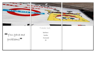
I started by making a blank template so that my picture was spread out equally. I used pictures that I took when I went to brick lane, I took an interest in the graffiti and decided I wanted to use it on my digipak.
After creating the template I then got my picture and spread it over the three columns and then cropped the three different parts of the picture (side, middle, side) to fit into each box.
I knew what the album covers of my chosen band looked like so I decided to go along the same line and have something simple but also eye catching.

I like my digipak, I think it looks well structured and eye catching. Some people may not get the idea of the picture used, I will explain that I used this picture because it almost gives off that tourist vibe which is what my album is about and with the London underground logo it backs up my idea even more as you would get the idea that tourists are always traveling and going from one place to the other.
Thursday, 6 April 2017
Subscribe to:
Comments (Atom)


